Empty States
UX | UI | Product Design | Design System

Empty State Designs
Enhancing the user experience of empty states across the ASCAP website was an opportunity to showcase the brand’s personality and help members understand different features and pages as they explore the site. The redesign considered these empty pages as teachable moments, giving users a hint of what would be there or a way of adding to their profile. This was one of the first components implemented into the live ASCAP.com site from the Quaver Design System.

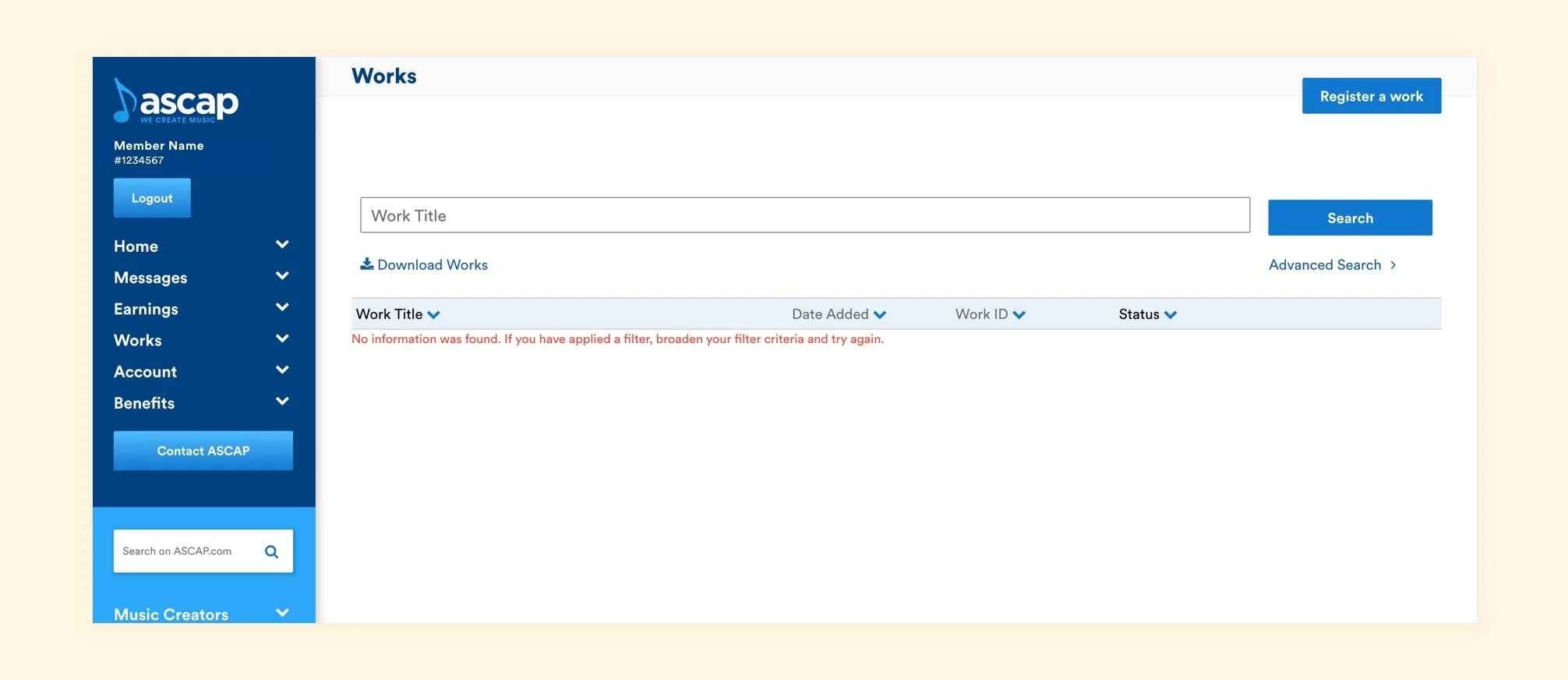
The new Works empty state encourages members to register songs so they can start earning royalties.

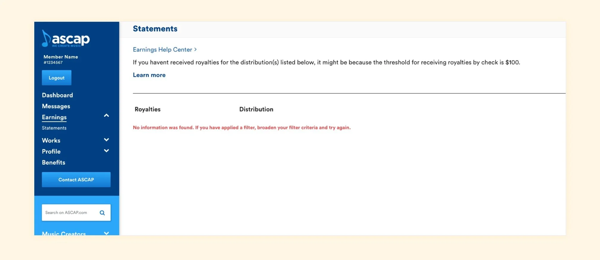
The Statements empty state has a similar goal: no registered songs = no royalties = no statements.


Research
Original Screens
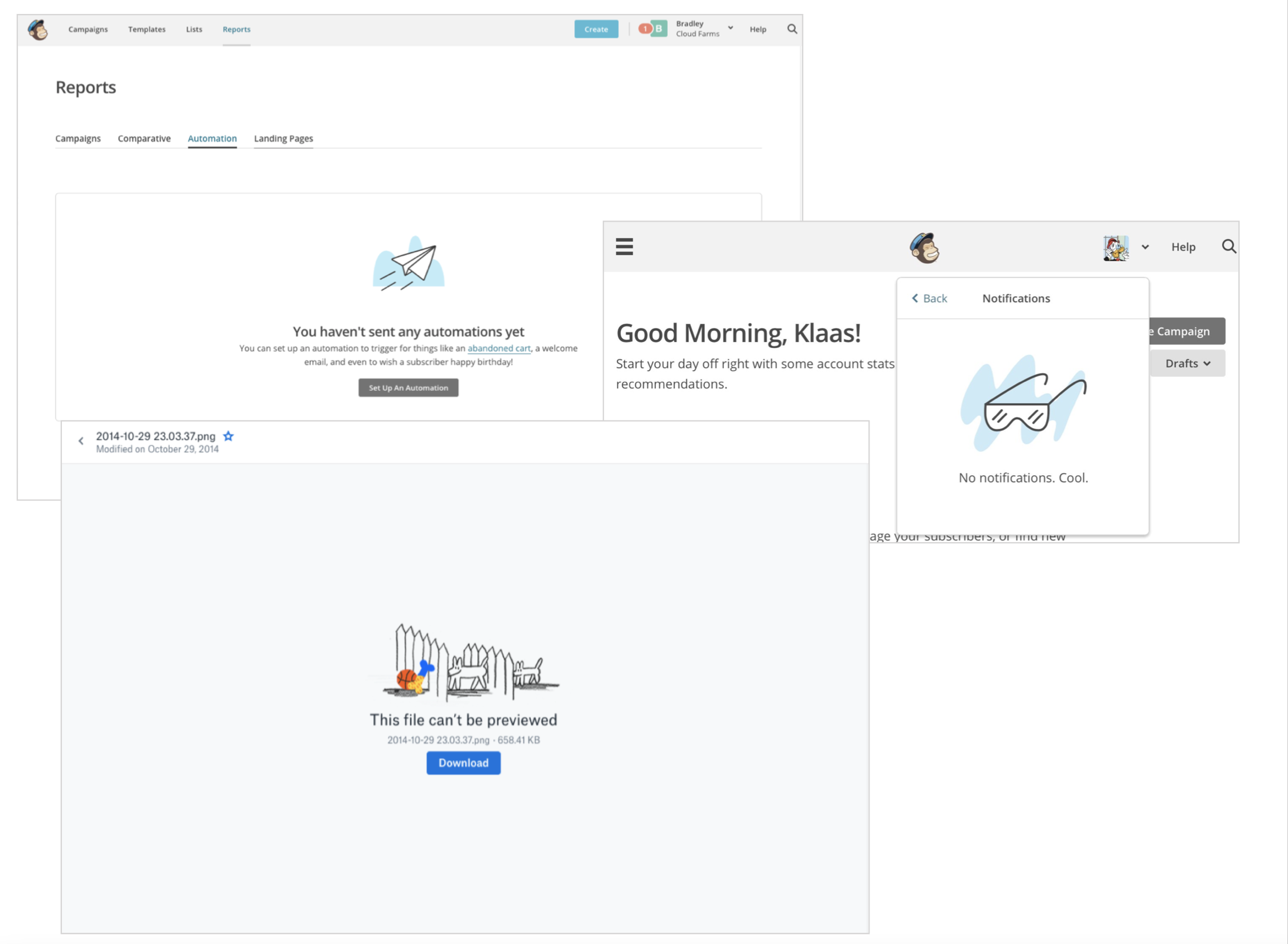
Before the redesign of empty states across Member Access, some pages had the same design whether or not they had content. Most of the pages looked like an error occurred, even though the user just arrived on the page without taking any actions.

This text was particularly confusing. When arriving on the Messages page, the user is presented with copy about broadening their search criteria, even though they haven’t searched on this page. In fact, they have no messages.
Organizing Page Types
One of the first steps in making these empty states better was to take inventory: understand all of the different pages, and different reasons, why a user would encounter an empty state.

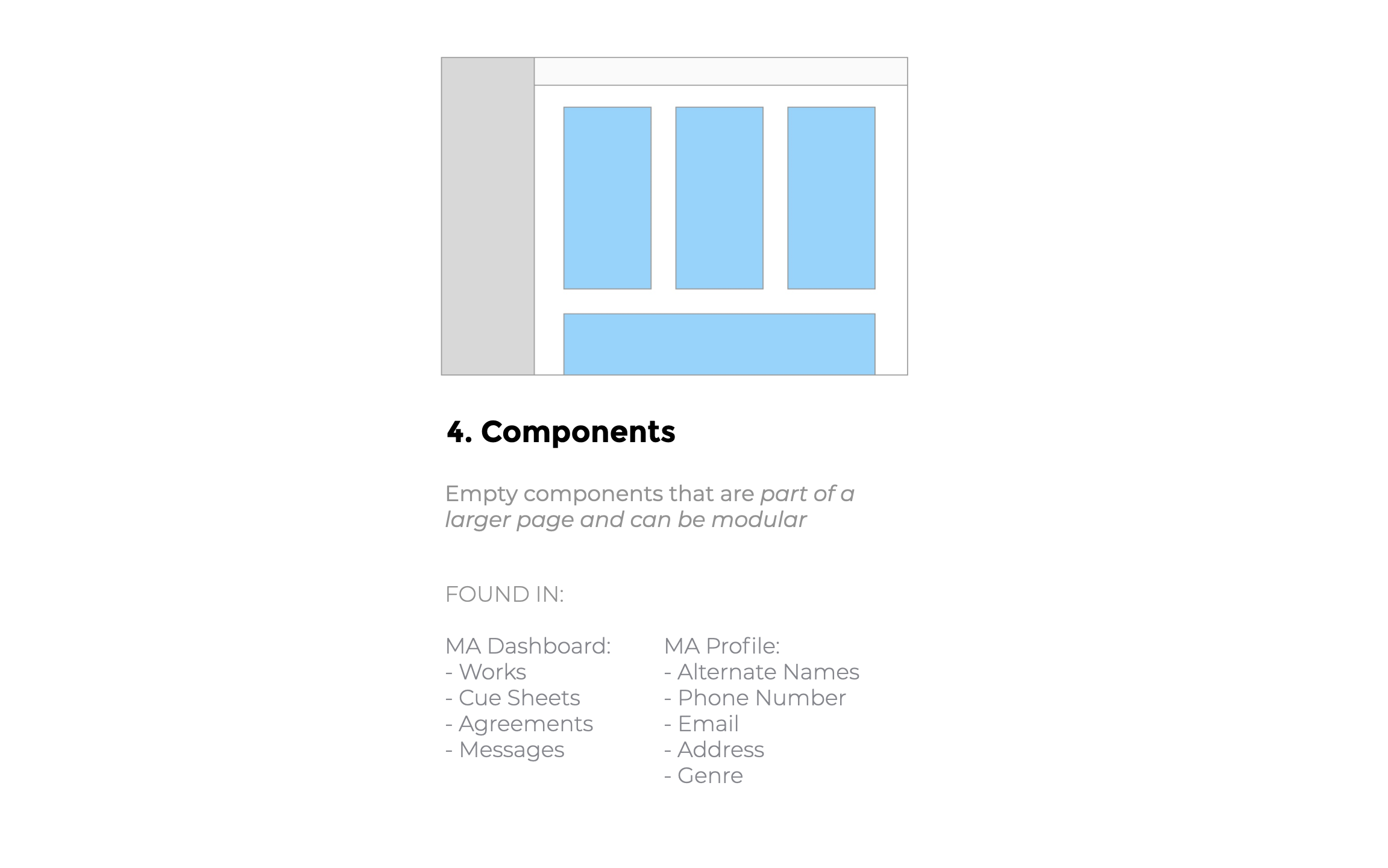
Illustration Styles
Simple Illustrations: Mailchimp and Dropbox had simple, effective empty states that still showed off the brand’s personality

Complex illustrations: Shopify had more complex illustrations paired with simple copy
Illustrator Research
At the beginning of the project, we wanted to explore hiring an illustrator to create these unique branded illustrations for ASCAP.


Where we landed
Ultimately, we decided to move forward with simple illustrations in-house by yours truly. They were considered an MVP to just fix the empty states in production. The team felt they were a good first stab at how we would like to address the communication problems on each page and get a sense of personality and tone of voice.